top of page

One Day
Vacation Mobile App
__________________________________________________________________________________________________
OVERVIEW
This was a project completed in April of 2025 over the course of a week. It is a mobile app called One Day for people to discover new places in the U.S. that they want to visit by seeing photos that others have taken there. The app has functionality for marking cities as favorites, finding popular businesses in cities, uploading/storing photos, and more.
PREVIEW

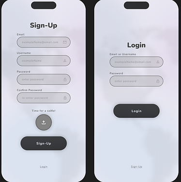
Welcome Pages

Main Pages

Secondary Pages
EMPATHIZE/DEFINE
After researching top rated apps (which would be considered part of the same genre as One Day) in order to learn about their user-preferences and expected features, I was able to determine what the goals should be for designing the app's layout.
The app design had to adhere to common standards of media apps such as simple navigation systems, organized photo storing, bookmarking, and more. At the same time, it had to avoid features which users of other apps commonly called out as negative. To assist in this process, I organized the positive and negative features into a table before starting the design.

Features Table
IDEATE
The first step was to figure out how to organize the app in a way which would allow for all of the needed functions to be easily located. To do so, I created a list of the features that I wanted included and used an AI application to organize them into groups that could then be divided up as pages in the navigation bar.
It was important not to leave out any of the desired features, otherwise users may feel that the app does not meet their needs no matter how organized it may be.
Once grouped, I then used these categories to help create the main pages.

Main Pages
STYLE GUIDE
After building the main pages, I formed a style guide based off of them so that any additional pages or pop-ups would share a similar look and feel. Some of the colors shared across the pages can be seen below.

Color Guide
ADDITIONAL PAGES
By referring to the main pages in conjunction with the color guide, I then began mapping each button on the main pages to a frame that it would lead to. This way I knew I would not forget to create a page and leave a button without functionality.
Then, after all buttons were mapped, I started creating the pages while adhering to the style guide. These pages included slide in pages, popups, and more. Several of them can be seen below.

Additional Pages 1

Additional Pages 2

Additional Pages 3
Additional Pages 4
WORKING PROTOTYPE
Next, I created the working prototype in Figma and tested it to make sure that there were no faulty animations or page links.
Several issues that I ran into were overlay shadows stacking and mistimed animations occurring. However, I quickly discovered the issues and were able to remedy them.
Once the problems were accounted for, I finally had a working simulation of how the app would look, feel, and navigate. Both the mapped pages and working prototype can be seen below.

Linked Page Frames

Working Prototype (Figma)
TESTING/ITERATION
After reviewing the working prototype, I realized that the user experience could be improved by making the entry to the app more welcoming. So, before being able to call the project finished, I revisited the ideation process to improve the user experience by adding welcome pages that would greet the user upon first opening the app.
These pages would guide the user through a quick rundown of the app's core features while not overwhelming them with too much information.
The welcome pages for the One Day app can be seen below.
Welcome Pages
FINAL THOUGHTS
Overall, the design process went well.
I decided to experiment with simplifying the navigation bar for this project by distinguishing the selected page icons with lighter shades rather than outlined/filled in icons. This strategy can work because using a very light shade for the selected icon still offers a clear distinction even with those who are unable to see a full range of color.
It is important to make sure that the distinction is not between different colors of the same shade, though. Otherwise those who are colorblind may see those colors as the same and will be unable to tell the difference, thus hurting their experience. Similarly, the page name should be and is still displayed at the top of each page in order to adhere to the WCAG (perceivable) standards.
This experimentation allowed for a less cluttered navigation bar and I think it was a valuable test. The project as a whole was also a positive experience and I look forward to carrying on what I learned into future design work.
bottom of page