top of page

Gift of Joy
Charity Donation Desktop Application
__________________________________________________________________________________________________
OVERVIEW
This was a project completed in early 2025 over the course of a few weeks. It is a charity app that manages user donations and encourages donating towards a diversity of causes. This encouragement comes in the form of various donation plans each encompassing different charities and each with a specific flower which will grow in a virtual garden as long as the user is donating to a monthly plan. Additionally, by subscribing to a charity donation plan and growing flowers, users will earn badges showcasing their generosity and highlighting which causes they have supported the most.
PREVIEW

Home Page

Plans Page

Garden Page

About Page

Encyclopedia Pop-up Page

Badges Pop-up Page
PROBLEM/GOAL
The goal was to create a desktop application which would allow users to manage their donations to multiple charities all from one location. Additionally, the secondary goal was to encourage people to donate towards many different causes so that no group struggling would be left behind.
This would address the issue of people simply setting up a plan, going away, and never considering switching their plan towards another cause. Similarly, the app would aim too address the issue of retaining the group of people who feel unfulfilled giving to others with nothing to keep track of their generosity.
Overall, the objective of the application is to encourage people to help others by making the process more enjoyable.
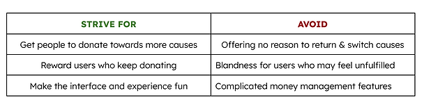
Features Table
CREATION
The first step was deciding how to divide the content while including all the desired features from the goal statement. After looking at existing similar apps and their reviews, it was ultimately decided to structure the app pages so that they displayed the content from most important to least.
For example, the home page would display the user donation history and current plan as this would be the core functionality of the application. Subsequent pages, such as the garden page, were considered additional functionality that some users may not even need. So, these would be included on separate lower tabs so that they would be out of the way for those users who simply wanted a well designed hub for all their donation needs.
Similarly, the badges section (which was initially planned to be its own page) was moved to be a subsection pop-up within the garden tab as users who did not care about the garden section would likely have little reason to use the badges section as well. However, those who did use the garden section, would likely be interested in the badges section as they go hand-in-hand. So, these two features were included together.
STYLE GUIDE
The primary color chosen for the site was royal blue to connect the design to the empathy of giving to others. The primary colors begin as shades of royal blue but taper off in saturation as the level of text moves from headings to secondary information.

Default Color Guide
Additionally, the highlight color, a bright green, can be seen throughout certain features of the design such as the current plan breakdown chart seen below.

Current Plan Breakdown Chart
Consistency across the cards can also be seen as both the cards and the buttons within them maintain similar corner rounding.

Current Plan Cards

Specific Plan Cards
MAIN PAGES
To avoid ending up with an inconsistent design, the main pages were designed first to help establish a defined style guide that would drive the rest of the pages (such as the less used popups or welcome pages). However, by selecting multiple pages simultaneously and modifying the joined color options, many pages could be altered together by changing one quick option. This was helpful to avoid having to spend lots of time late in the design process changing features that showed up in many different places.
For example, there were over ten popup pages used throughout the site. It is important that they all keep a similar style. So, by utilizing the built in features in Figma, it allowed for the editing of card corners, colors, fonts, etc. all at once across the pages.
Home Page
Plans Page
Garden Page
About Page
SECONDARY PAGES
Once the main pages were complete, it was important to review the wire-framing process to make sure that every button on a main page had the accompanying new page or popup that it would lead to. To make sure none were missed, I went through each main page, one at a time, and completed the designs for the pages of each button on that page. This way, once I moved on from a main page, it had all of its popup pages ready to be linked.
I repeated this process with each main page until all the necessary popups were finished. The primary popups can be seen below.

Profile Pop-Up Page

Payment Plan Pop-Up Page

Add New Flower Pop-Up Page

Badges Pop-Up Page

Encyclopedia Pop-Up Page

Flower Plan Pop-Up Page
PROTOTYPE
When all of the commonly used pages were finished, I went into the Figma prototype section to connect the finished designs together by linking the buttons with their appropriate page from the wire-frames. I could then open the application in a separate window and see how navigating throughout the app would look on the actual device. This presentation feature was also useful in the earlier design stages to make sure that the sizing and layout were tailored for multiple device sizes and not just my own screen.

Connected Final Pages
FINAL THOUGHTS
Overall, the project went well. I was glad to work on another desktop application to increase my experience in this area. Similarly, by completing the working prototype, I was able to make a nearly completed project only without the functionality of financial storing and security.
More importantly, I was glad to complete another project focused on helping others that I can one day invest in to get it fit with the final functionality features.
Planning the layout of the site before beginning was also very helpful in making the project go smoothly without setbacks which is why I was able to complete it in less than 2 weeks.
As I design more, it is fun to refine my design process and learn new ways to increase my speed and efficiency when working.
bottom of page